How To Read A Candlestick Chart
BY Chris Andreou
|December 3, 2021Knowing how to read a candlestick chart is one of the essential skills you must learn in trading.
One of them is a candlestick chart of current and historical prices. This is probably the single most important tool in a trader’s arsenal. Without it, trading would become much more difficult.
Charts are like windows that allow you to view what is happening in the market.
The better you get at reading price charts, the better you will become at anticipating and predicting future price movements.
In this one, you will learn:
- How to read a candlestick chart
- Some common candlestick formations and what they mean
- Learn how to use candlestick charts for trading
Hopefully, after reading this article, you will understand what is happening in the markets better.
So with that being said, let’s get straight in to it.
How to read candlestick charts
Candlestick charts plot price over time.
The vertical axis on the chart represents the price or the exchange rate between two currencies.
The horizontal axis represents what the price did over time.

Currency price movements are segmented in to time intervals and each interval has four data points.
These data points are:
- The opening price
- The closing price
- The high price
- And the low price

Time intervals typically range from 1 minute periods to monthly periods. Meaning that you can view the price chart where price data is segmented in to one minute intervals, 5 minute intervals, and hourly intervals and so on, up to monthly intervals.

Each interval has an opening price, a closing price, the highest price and a lowest price for the interval.
So for example, if you are viewing the H1 chart, each interval represents one hour’s worth or price action. The opening price is plotted at the beginning of each hour and for every hour as long as the market is open.
The closing price is constantly moving throughout the hour until the end of the hour, when it becomes fixed. As the price action unfolds for the interval, the candlestick is being drawn in real time.
Then, when the interval ends, the candlestick becomes fixed in time encapsulating and recording the four data points already mentioned. Then a new interval begins on the next hour.
If you are viewing the 15M chart, each interval would represent 15 minutes’ worth of price action. The opening price would be plotted at the beginning of the hour, 15 minutes past the hour, 30 minutes past the hour and 45 minutes past the hour.
Candlestick charts have multiple timeframes. There would be 4 15 minute intervals or candlesticks for every hourly candlestick.
Similarly, 4 hourly intervals or candlesticks would make up one 4 hour interval or candlestick.
And 6 hourly intervals or candlesticks would make up one daily candlestick
Basically, candlesticks blend together and this allows you to view the market with different perspectives or with more or less detail.
Changing the chart from the higher time frames to the lower ones allows you to view what happened inside the candlestick.
I will talk more about that in a moment.
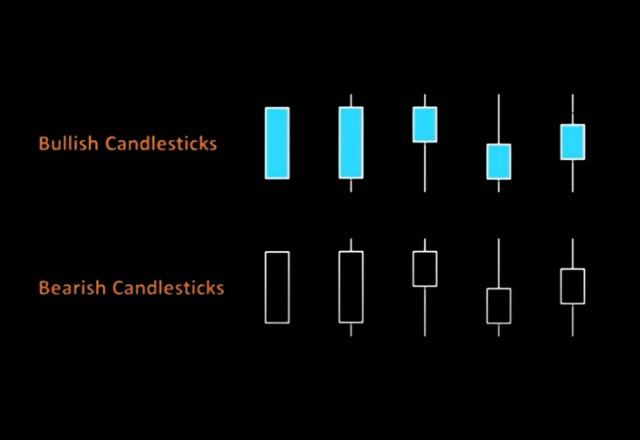
When the closing price is higher than the opening price, the candles are usually one colour. In this case they are painted blue and these are known as bullish candlesticks.
When the closing price is lower than the opening price, the candles are usually painted in another colour. In this case they are painted black and these are known as bearish candlesticks.

Bullish candlesticks represent rising prices and bearish candlesticks represent falling prices.
That is how price charts are plotted and I think you get the idea.
Let’s move on.
The anatomy of a candlestick chart
Each candlestick has a body and usually a wick above and below it.

The body of the candlestick chart is made up from the open and close prices. This is the price area that is rectangular and filled.
Bullish and bearish candlesticks indicate uptrends or downtrends in price for the interval or over a series of intervals.
If the candlestick does not have an upper or lower wick, it means that the opening or closing price was also the highest or lowest price for that interval.
If the candlestick doesn’t have a body, then they can be considered indecisive candlesticks. How the wicks appear and where they appear on the chart can give you a clue. They can suggest a pause in the trend or a potential reversal of the trend.

Candlestick formations can occur in many variations and where or how they appear on the chart can have different meanings.
We will get to this in a moment.
The point is that learning how to read a candlestick chart is like learning a different language.
Looking at one candlestick alone is like reading one word. Reading a series of candlesticks together is like reading a sentence.
When you can string enough sentences together to make paragraphs and chapters, you might be able to understand the story.
And part of being able to do that involves knowing how to blend candlesticks together.
Blending candlesticks
Blending candlesticks involves using the open, high, low and closing prices of several candlesticks to create one.
This is what allows you to view Forex price data with greater or lesser detail over various timeframes.
But, it also allows you to see the hidden signals in the market that may occur over a sequence of candlesticks, not on any particular time frame.
Lets start with a basic example, with how the different time frames are created on the charts.
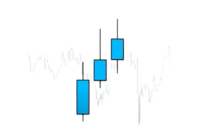
This candlestick represents one days’ worth of price action. We can see that it is a bullish candle and it has a body with wicks on the top and bottom of it.

However, this candlestick omits the details about how the candle was formed over the course of the day.
On the 4H candlestick chart, you will see something different.
There are 6 x 4 hour candlesticks in a trading day.
If we take the opening price of the first 4 hour interval, the lowest price reached from any of the 6, 4 hourly candlesticks, the highest price reached from any of the 6, 4 hourly candlesticks and the closing price from the last one as well. They can be combined to equal this one daily candlestick.

But the 6, 4 hourly candlesticks tell us that the sellers tried to pull the price back half way through the day and then got overwhelmed towards the close. The buyers finished strong.
There also doesn’t seem to be any candlesticks here that might suggest that the buyers are starting to get weak. However, further analysis can be done on a lower timeframe to determine whether the buyers are likely to remain in control in the short term.
These two higher time frames suggest that conditions are likely to remain bullish.
I hope this makes sense, now let’s move on. I want to outline some common candlestick patterns and explain what they mean.
Common candlestick patterns explained
To become proficient in reading candlestick charts, you have to understand what the different formations mean.
Traders use candlestick patterns and formations to signal trading opportunities or as clues to what the price might do next.
This can be from a single candlestick or a combination of candlesticks. But like any other trading indicator, these are not absolutes and should not be used in isolation. It is best to use a combination of indicators when making trading decisions
Candlestick patterns can either be categorized as continuation or reversal patterns.

As the label suggests:
- Continuation patterns usually signal continuations of the current price trend
- And reversals patterns usually signal reversals of the current price trend
However, this is relative to the overall price trend and the time frame they appear on. The higher time frames take greater precedence over the lower ones.
I will start with some bullish formations and then move to the bearish ones. They are just the inverse of each other.
Bullish candlestick formations

This is a sign of strength. These candlesticks have a relatively wide price range, a relatively wide body with the price closing close to the highs.
This also indicates that volatility or momentum picked up.

This formation can also be seen as a sign of strength. It is a bullish candlestick with a wide price range and a relatively narrow body close to its highs.
It shows us that the sellers tried to drive the price down but buyers recovered.
When a candlestick like this appears after a move down, there might be signs of exhaustion or a temporary bottom might be forming. But after a move up, it can also be seen as a sign of weakness.

This is a neutral formation. It is a bullish candlestick with a narrow price range. The candlesticks body is relatively wide compared to the range but narrow relative to other candlesticks that precede it.
This formation can indicate that volatility or price momentum is slowing down.
Unlike the other formations with wide price ranges that show that volatility picked up.

This formation can be seen as a sign of weakness. It is a bullish candlestick with a wide price range and a relatively narrow body close to its lows.
It shows us that buyers tried to push the price up but sellers recovered.
When a candlestick like this appears after a move up, there might be signs of exhaustion or a temporary top might be forming. But after a move down, it can also be seen as a sign of strength.

This is a signs of indecision. It is a candlestick with a relatively wide or narrow price range with an opening and closing price close to the middle of the range.
This formation suggests that buyers and sellers are equally matched or the market is currently undecided about where to take the price next.
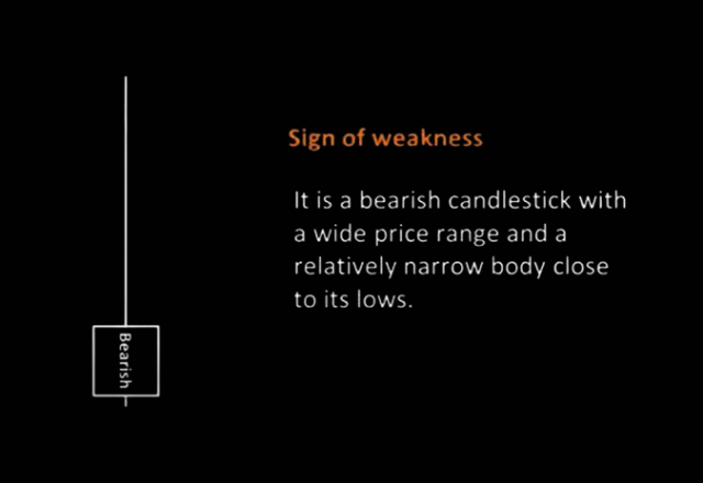
Bearish candlestick formations
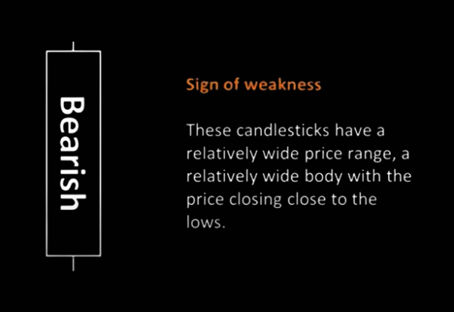
This is a sign of weakness. These candlesticks have a relatively wide price range, a relatively wide body with the price closing close to the lows.
It also shows that volatility or momentum picked up.
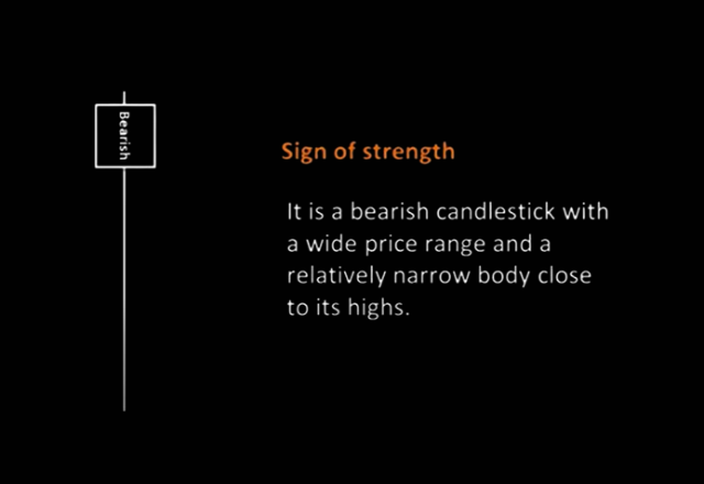
This formation can also be seen as a sign of strength. It is a bearish candlestick with a wide price range and a relatively narrow body close to its highs.
It shows us that the sellers tried to drive the price down but buyers recovered.
When a candlestick like this appears after a move down, there might be signs of exhaustion or a temporary bottom might be forming. But after a move up, it can also be seen as a sign of weakness.

This is a neutral formation. It is a bearish candlestick with a narrow price range. The candlesticks body is relatively wide compared to the range but narrow relative to other candlesticks that precede it.
This formation can indicate that volatility or price momentum is slowing down.
Unlike the other formations with wide price ranges that show that volatility picked up.
This formation can be seen as a sign of weakness. It is a bullish candlestick with a wide price range and a relatively narrow body close to its lows.
It shows us that buyers tried to push the price up but sellers recovered.
When a candlestick like this appears after a move up, there might be signs of exhaustion or a temporary top might be forming. But after a move down, it can also be seen as a sign of strength.

This is a signs of indecision. It is a candlestick with a relatively wide or narrow price range with an opening and closing price close to the middle of the range.
This formation suggests that buyers and sellers are equally matched or the market is currently undecided about where to take the price next.
Each candlestick is trying to tell you something. What they are trying to say will vary depending on what candlesticks or price action preceded them.
So, let’s take a look at some common candlestick patterns that might indicate continuations in the price trend or the reversal of it.
Candlestick chart patterns
When you open your charts it is best to take a top down approach. Meaning that these formations will be more significant on the higher time frames.
I am going to start and give you some continuation patterns and then move on to some reversal patterns.
Here is the first one.
The first one is what is referred to as an inside bar.
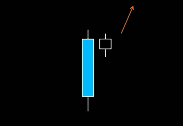
The candle that preceded it is a strong bullish or bearish candle with a wide price range and relative body. This indicates that price momentum picked up. Then, this is followed by a bar or bars with a narrow price range and relative body, close the previous bars high. But the high and low does not exceed the previous bars high.
This can also form in various ways, such as having multiple candlesticks inside the preceding bar. But they all indicate the potential for the current price trend to continue higher or lower.
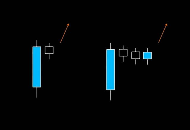
You can just invert this pattern for the bearish version. Like this.

For the reversal patterns, there is what is referred to as shooting or morning stars.

Signs of weakness or strength can be seen after an up or down move in the price.
So for example, after a run up, a candlestick formation that shows signs of weakness might appear.
This can indicate that buyers are getting exhausted or sellers are starting to enter the market with strength.
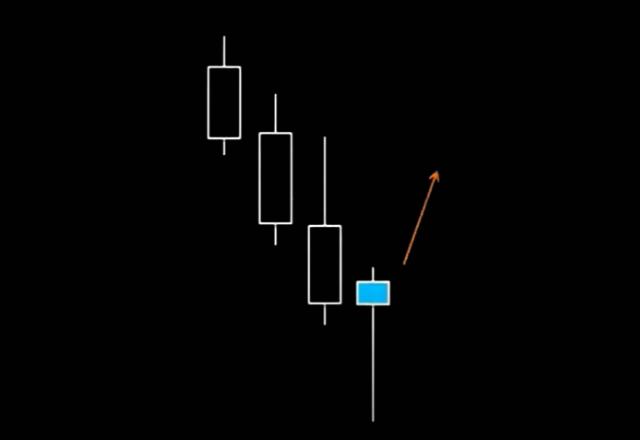
The inverted version is what is referred to as morning stars; signs of strength can be seen after a move down. Then a candlestick formation might appear that suggests signs of strength.
This can indicate that sellers are getting exhausted or buyers are starting to enter the market with strength.
There are many more patterns and as a bonus, I am going to give you a quick cheat sheet.
These patterns can be inverted because they can be seen for bullish or bearish market conditions.
Candlestick chart patterns cheat sheet

Learning how to read candlestick charts requires study and practice. Sometimes they work and sometimes they don’t, that’s trading.
But being able to get a better read on the markets will help you identify trading signals and anticipate future price movements.
You will learn how to read candlestick charts better with observation, further study and practice.
Create your demo or live account and download the MT4 or MT5 trading platforms to get access to them.

Risk disclaimer: CFDs are complex instruments and come with a high risk of losing money rapidly due to leverage. You should consider whether you understand how CFDs work and whether you can afford to take the high risk of losing your money. Never deposit more than you are prepared to lose. Professional client’s losses can exceed their deposit. Please see our risk warning policy and seek independent professional advice if you do not fully understand. This information is not directed or intended for distribution to or use by residents of certain countries/jurisdictions including, but not limited to, USA & OFAC. The Company holds the right to alter the aforementioned list of countries at its own discretion.
Join us on social media

Experienced independent trader
Related Posts