What Is a Candlestick Chart? Patterns, Analysis & How to Read Them
BY Maria K.
|August 6, 2026A candlestick chart is a financial chart that displays price movement using individual "candles," each showing the open, high, low, close prices for a specific time period. Understanding what is a candlestick chart and how to read one is fundamental to technical analysis. This visual tool, used across stocks, forex, crypto, and commodities, translates raw price data into trading patterns that reveal market sentiment.
This article includes an explanation of candlestick chart basics, covers how each candle forms and what the components represent. Readers can learn about candlestick chart anatomy, candlestick key patterns, and know how candlestick charts work in real market conditions.
Candlestick Chart Explained
A candlestick chart is a type of financial chart used in technical analysis to display the price movement of an asset over a specific time period. Each "candlestick" on the chart represents one time interval (one day, one hour) and shows four key price points: the open, high, low, and close (OHLC). The color and shape of each candlestick instantly show if prices went up or down during that period. Sometimes a candlestick chart is called a candlestick graph, the terms are interchangeable.
What Is a Candlestick Chart? A Clear, Simple Definition
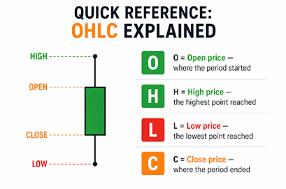
Candlestick chart definition: A candlestick chart is a price visualization tool that compresses four data points - open, high, low, and close (OHLC) - into a single graphic element called a candlestick. Each candlestick represents one unit of time, whether that's one minute, one hour, one day, or one month.
The OHLC chart format matters because each data point tells part of the story.
- The open shows where market sentiment stood at the period's start.
- The high and low reveal the extremes that buyers and sellers pushed prices to.
- The close, often considered the most important, shows where the market settled when that period ended.
Candlestick charts work for any traded asset: stocks, forex pairs, cryptocurrencies, commodities, and indices. What are candlestick charts used for? Their core value lies in translating raw price action into a visual story of market psychology, making it possible to identify patterns that suggest potential future movement.
The History of Candlestick Charts: From Japanese Rice Markets to Wall Street
Developed by rice trader Munehisa Homma in 18th-century Japan, they are also called Japanese candlestick charts. Homma recognized that trader psychology drives price, not just supply and demand fundamentals. He observed that emotions like fear, greed, hope, created predictable patterns in rice prices.
Candlestick charting evolved over centuries of Japanese rice trading before Western traders discovered it. The technique exploded in popularity during the digital trading era as charting software made candlestick pattern analysis accessible to retail traders worldwide.
Candlestick Chart vs. Line Chart vs. Bar Chart: Which Is Better for Traders?
- Candlestick charts provide the richest information density of the three major chart types, making them the preferred choice for traders conducting technical analysis.
- Line charts connect closing prices with a continuous line, offering simplicity but hiding open, high, and low data.
- Bar charts (also called OHLC charts) display all four price points using horizontal ticks on a vertical line, but lack visual clarity.
| Feature | Line Chart | Bar Chart | Candlestick Chart |
| Shows open price | X | ✓ | ✓ |
| Shows high price | X | ✓ | ✓ |
| Shows low price | X | ✓ | ✓ |
| Shows close price | ✓ | ✓ | ✓ |
| Visual clarity | Low | Medium | High |
| Pattern recognition | Limited | Moderate | Excellent |
| Best for | Long-term trends | Traditional analysts | Active traders |
Anatomy of a Candlestick Chart: Every Part Explained
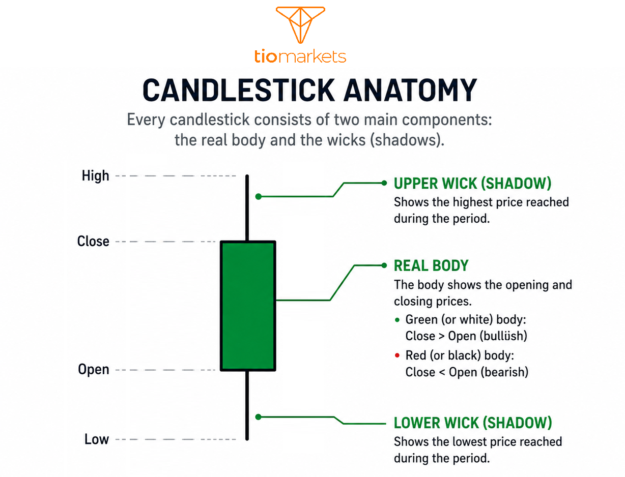
Every candlestick consists of two main components: the real body and the wicks (shadows). Understanding these parts is essential before analyzing candlestick chart patterns.
Candlestick Chart: The Real Body
The real body is the rectangular center of the candlestick, representing the range between open and close prices. A long body indicates strong conviction, i.e. significant price movement between the open and close. A short body suggests indecision or consolidation.
What is the Wick on a Candlestick Chart? Upper Wick and Lower Wick
The upper wick (upper shadow) is the thin line extending above the body, representing the highest price reached during the period. A long upper wick indicates that buyers attempted to push prices higher but were rejected by sellers before the close. Wicks and shadows reveal rejected price levels.
The lower wick (lower shadow) extends below the body, representing the lowest price reached. A long lower wick shows that sellers pushed prices down but buyers stepped in, recovering much of the loss before the period closed.
The Tail
The tail refers to the combined measurement of both wicks. Longer tails indicate higher volatility and more indecision during the period. Short or absent tails suggest one side maintained control throughout with minimal resistance.
How to Read Candlestick Charts Step by Step
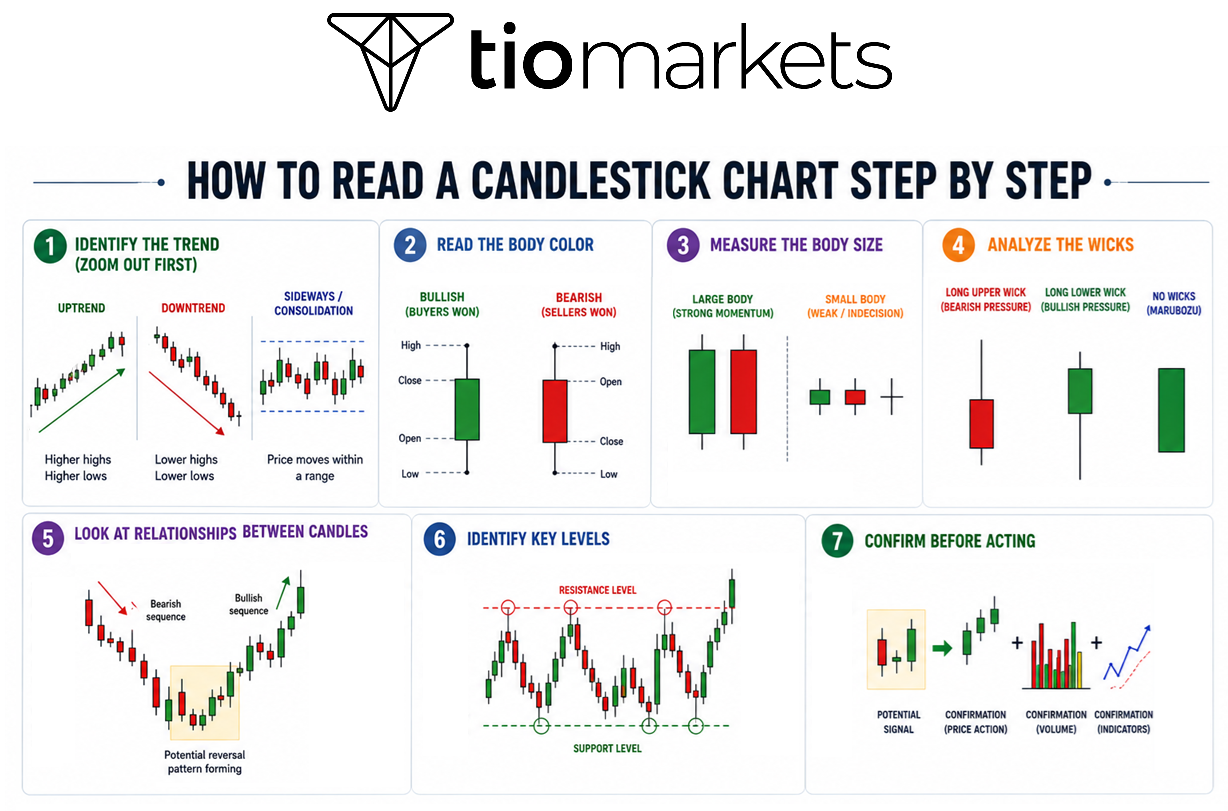
Reading a candlestick chart involves analyzing individual candles, their relationships to each other, and their context within the broader trend. Read on to learn how to read a candlestick chart.
Step 1: Identifying the Trend (Zoom Out First)
Before analyzing individual candles, assess the broader picture. Determine whether the market is in an uptrend, downtrend, or sideways consolidation.
Step 2: Reading the Body Color
Green or white indicates buyers won that period (bullish). Red or black indicates sellers won (bearish).
Step 3: Measuring the Body Size
Large bodies reflect strong momentum and conviction. Small bodies suggest weak momentum, indecision, or consolidation.
Step 4: Analyzing the Wicks
Long upper wicks indicate price rejection at higher levels (bearish pressure). Long lower wicks indicate rejection at lower levels (bullish pressure). No wicks (Marubozu candles) suggest complete domination by one side.
Step 5: Looking at Relationships Between Candles
Single candles provide hints; multiple candles tell the full story. Traders pay attention to patterns forming across one, two, or three candles; and changes in body size, wick length, and color sequences.
Step 6: Identifying Key Levels
Note where prices reverse or stall repeatedly. These support and resistance levels are where candlestick patterns tend to carry the most significance.
Step 7: Confirming Before Acting
Candlestick patterns suggest probabilities, not certainties. Many traders wait for confirmation from subsequent candles, volume analysis, or secondary indicators.
Candlestick Chart Timeframes: How Choosing the Right One Changes Everything
Understanding what is a candlestick chart also means understanding that the same chart can tell different stories depending on the timeframe you select.
| Timeframe | Each Candle Represents | Commonly Used By |
| 1-minute / 5-minute | 1 or 5 minutes | Scalpers, high-frequency day traders |
| 15-minute / 30-minute | 15 or 30 minutes | Intraday traders |
| 1-hour / 4-hour | 1 or 4 hours | Swing traders |
| Daily | 1 full trading day | Position traders, investors |
| Weekly / Monthly | 1 week or 1 month | Long-term investors |
Multi-timeframe analysis involves using a higher timeframe to identify the overall trend and a lower timeframe to refine entry timing. A bearish candle on a 5-minute chart may mean little if the daily chart shows a strong uptrend. Understanding which timeframe tells the story that matters for your trading approach is essential.
Bullish and Bearish Candlesticks: What the Colors and Shapes Tell You
Bullish candlestick patterns close higher than they open, while bearish candlestick patterns close lower than they open. This fundamental distinction forms the basis for all candlestick chart analysis. Color conventions vary by platform, but typically green/white typically represents bullish candles, while red/black represents bearish candles.

Essential Bullish Candlestick Chart Patterns: Signals That Prices May Rise
Bullish patterns signal a potential shift from selling pressure to buying pressure, either a reversal of a downtrend or continuation of an uptrend. Most traders believe that bullish patterns have more gravity when they appear at the bottom of a confirmed downtrend, at a known support level, and are accompanied by increasing volume.
Below you can check all the essential bullish candlestick chart patterns with information like how they look, what they mean, and when they are worth your attention.
| Pattern | Type | Appearance | What It Means | Pay Attention When |
| Hammer | Single-Candle | Small body, long lower wick | Sellers pushed prices down, but buyers pushed back up | At the bottom of a downtrend near support |
| Inverted Hammer | Single-Candle | Small body, long upper wick | Buyers are starting to fight back against the downtrend | At the bottom of a downtrend; wait for confirmation |
| Dragonfly Doji | Single-Candle | No body, long lower wick | Sellers tried to push down, but buyers recovered all losses | At support levels after a decline |
| Bullish Engulfing | Two-Candle | Large green candle covers the entire previous red candle | Buyers have taken control from sellers | At the bottom of a downtrend with high volume |
| Bullish Harami | Two-Candle | Small green candle inside a large red candle | Selling is slowing down | At support levels, wait for confirmation |
| Tweezer Bottom | Two-Candle | Two candles with the same low point | Price found a floor where buyers step in | At key support levels |
| Morning Star | Three-Candle | Red candle → small candle → green candle | Downtrend may be ending | At the bottom of a sustained downtrend |
| Three White Soldiers | Three-Candle | Three green candles in a row, each closing higher | Strong buying pressure continues | After a downtrend or during early uptrend |
| Rising Three Methods | Five-Candle | Green candle → three small red candles → green candle | Brief pause, then uptrend continues | During an established uptrend |
Essential Bearish Candlestick Plot Patterns: Signals That Prices May Fall
Bearish patterns signal a potential shift from buying pressure to selling pressure, either a reversal of an uptrend or continuation of a downtrend. Most traders think that bearish patterns tend to carry more weight when they form at the top of a sustained uptrend, at a well-established resistance level, and when accompanied by high volume.
Single-Candle Bearish Patterns
- Shooting Star: small body, long upper wick, appears at top of uptrend; indicates buyers rejected at resistance
- Hanging Man: identical structure to hammer but appears at top of uptrend; warns of weakening momentum
- Gravestone Doji: no body, long upper wick; buyers pushed price up but sellers completely reversed it
Two-Candle Bearish Patterns
- Bearish Engulfing: large red candle completely engulfs prior green candle; signals decisive shift to selling
- Bearish Harami: small red candle contained within prior large green candle; indicates buying momentum fading
- Tweezer Top: two candles with matching highs; confirms strong resistance level
Multi-Candle Bearish Patterns
- Evening Star: green candle + small indecision candle + strong red candle; classic reversal at uptrend top
- Three Black Crows: three consecutive large red candles, each closing lower; indicates sustained selling momentum
- Falling Three Methods: strong red candle, three small green candles, another strong red candle; signals downtrend continuation
Want to test your candlestick chart skills?
Practicing candlestick chart reading on a TIOmarkets demo account allows you to develop pattern recognition skills without risking real capital.
Trading is risky
What Candlestick Charts Tell You about Market Trends
In the section above, we've looked at patterns two ways: by bullish vs bearish, i.e. which direction the pattern suggests (up or down), AND by candle count, i.e. how many candles form the pattern. Now we will add a third lens: what the candlestick chart pattern tells you about the current trend. This matters because two patterns can both be bullish but mean very different things. For example:
- Bullish Engulfing is bullish and a reversal; it appears when a downtrend is ending
- Three White Soldiers is bullish and a continuation; it appears when an uptrend is already underway and likely to keep going
Both suggest that price may rise. But one signals a change in direction, while the other signals more of the same. Understanding this distinction helps you know not just where price might go, but what kind of move you're catching: a fresh reversal or an ongoing trend.
Reversal Patterns: The Trend May Be Changing
These patterns appear when a trend is losing steam. They warn you that buyers and sellers are switching roles, what was going up may be about to go down, and vice versa. Reversal patterns need a trend to reverse. A hammer in the middle of sideways movement doesn't mean much; it needs to appear after a clear downtrend to signal anything useful.
Bullish Reversals (look for these after a downtrend)
- Hammer
- Inverted Hammer
- Bullish Engulfing
- Morning Star
- Dragonfly Doji
Bearish Reversals (look for these after an uptrend)
- Hanging Man
- Shooting Star
- Bearish Engulfing
- Evening Star
- Gravestone Doji
Continuation Patterns: The Trend Will Likely Resume
These patterns appear during a pause in the trend. They signal that despite a brief rest, the dominant force (buyers or sellers) is still in control. Most traders put more weight on continuation patterns than reversals because they follow existing momentum rather than fighting it. The trend is your friend and these patterns confirm it's still alive.
Bullish Continuation (uptrend pauses, then continues)
- Three White Soldiers
- Rising Three Methods
Bearish Continuation (downtrend pauses, then continues)
- Three Black Crows
- Falling Three Methods
Indecision Patterns: The Market Is Uncertain
These patterns show that neither buyers nor sellers have taken control. The market is at a standoff, and a significant move could happen in either direction. Indecision patterns are warning signs, not action signals. They signal that something is about to happen, but not what. Most traders wait for the next candle or two to confirm direction before making a move.
- Doji (and its variants: Long-Legged, Dragonfly, Gravestone)
- Spinning Top
- Harami (Bullish and Bearish)
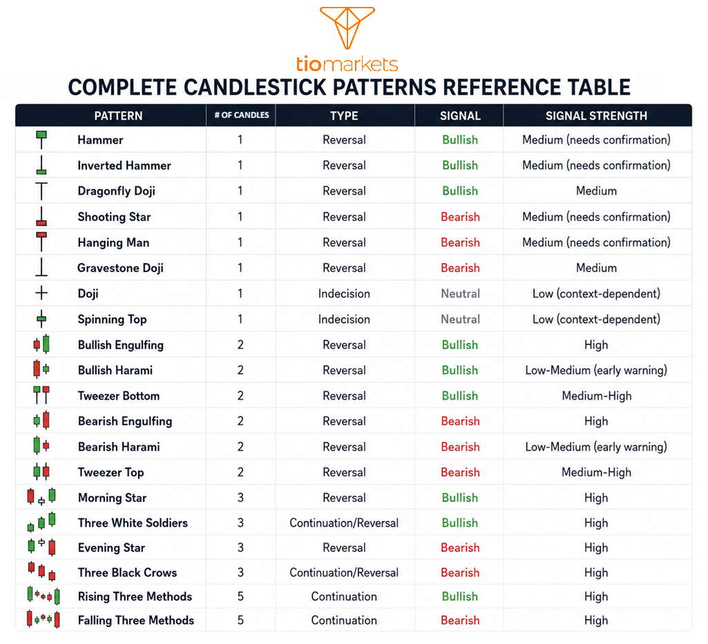
Complete Candlestick Patterns Quick-Reference Table
The following table summarizes essential patterns for candlestick chart technical analysis reference.
How to Apply Candlestick Charts in Real Trading: Practical Examples
Candlestick chart analysis becomes most valuable when applied within the context of overall market structure, key price levels, and confirmation signals.
Example 1: Spotting a Bullish Reversal in a Stock
Consider a stock in a three-week downtrend that forms a Hammer candle at a known support level, i.e. a price where buyers have previously stepped in. The hammer appears with above-average volume, suggesting increased participation. The following session produces a large bullish candle that closes above the hammer's high.
In this scenario, the pattern provides several reference points: the hammer's low often serves as a logical area for stop-loss consideration, while previous resistance levels above may serve as potential targets. The confirmation candle adds weight to the reversal signal.
Example 2: Identifying a Bearish Reversal in Forex
What is a candlestick chart in forex? The same tool stock traders use, applied to currency pairs. In this example, we examine a bearish reversal setup. A currency pair in a strong uptrend approaches a known resistance level; a price that has rejected advances multiple times historically. A Shooting Star forms at this level, showing buyers pushed higher but were rejected. The next session produces a bearish engulfing candle.
This combination (shooting star at resistance followed by bearish engulfing) represents a textbook reversal setup that many traders monitor for potential short positions.
Example 3: Reading Indecision in Cryptocurrency
Bitcoin has been trending upward when a Doji appears near a major resistance level. The doji alone doesn't provide directional information, it simply indicates that buyers and sellers are in balance at that moment.
Rather than acting on the doji immediately, many traders wait to see how the market resolves this indecision. If the next candle breaks below the doji's low with conviction, it may suggest the uptrend is losing momentum. If it breaks above the doji's high, the uptrend may continue.
This example reinforces a key principle: patterns suggest probabilities, not certainties. Confirmation from subsequent price action adds reliability to any candlestick signal.
Limitations of Candlestick Charts (And When to Use an Alternative)
Candlestick charts, like all analytical tools, have limitations that traders should understand.
Key limitations
- False signals: Even textbook-perfect patterns fail regularly
- Subjectivity: Two analysts can look at the same chart and identify different patterns
- Lagging nature: Patterns only form after price has moved; they are reactive, not predictive
- Noise on short timeframes: Very short intervals produce numerous signals, many of which lack significance
- Sparse data: Infrequently traded assets may produce unreliable patterns
- Missing intra-candle information: A daily candle doesn't reveal what happened at different points during the session
When do traders consider alternatives?
- Simple long-term trend visualization → Line chart
- Minimalist price analysis → OHLC bar chart
- Smoother trend identification with reduced noise → Heikin-Ashi chart
- Presenting to non-trading audiences → Line or area chart
Many traders combine candlestick analysis with at least one other form of confirmation, volume, trend lines, key price levels, or technical indicators, to filter signals.
Key Takeaways: What Is a Candlestick Chart and Why It Matters
Now that you understand what is a candlestick chart in trading, here are the essential points to remember:
- The body shows the open-to-close range; wicks show the high and low extremes
- Green/white candles are bullish (close > open); red/black candles are bearish (close < open)
- The size of the body reflects momentum; the length of wicks reflects rejection and indecision
- Candlestick patterns fall into three categories: reversal, continuation, and indecision
- Context matters: the same pattern carries different implications in different trend environments
- Many traders combine candlestick analysis with volume, support/resistance, and secondary indicators
Candlestick charts offer a visual window into market psychology, showing the ongoing battle between buyers and sellers in every time period. For those interested in deepening their understanding, exploring technical analysis fundamentals and trading basics for beginners can provide valuable context.
Now that you know what a candlestick chart is and how to read one, it's time to start practising this knowledge.

FAQ
Risk disclaimer: CFDs are complex instruments and come with a high risk of losing money rapidly due to leverage. You should consider whether you understand how CFDs work and whether you can afford to take the high risk of losing your money. Never deposit more than you are prepared to lose. Professional client’s losses can exceed their deposit. Please see our risk warning policy and seek independent professional advice if you do not fully understand. This information is not directed or intended for distribution to or use by residents of certain countries/jurisdictions including, but not limited to, USA & Countries included in the OFAC sanction list. The Company holds the right to alter the aforementioned list of countries at its own discretion.
TIOmarkets offers an exclusively execution-only service. The views expressed are for information purposes only. None of the content provided constitutes any form of investment advice. The comments are made available purely for educational and marketing purposes and do NOT constitute advice or investment recommendation (and should not be considered as such) and do not in any way constitute an invitation to acquire any financial instrument or product. TIOmarkets and its affiliates and consultants are not liable for any damages that may be caused by individual comments or statements by TIOmarkets analysis and assumes no liability with respect to the completeness and correctness of the content presented. The investor is solely responsible for the risk of his/her investment decisions. The analyses and comments presented do not include any consideration of your personal investment objectives, financial circumstances, or needs. The content has not been prepared in accordance with any legal requirements for financial analysis and must, therefore, be viewed by the reader as marketing information. TIOmarkets prohibits duplication or publication without explicit approval.
Join us on social media



Authors BIO

Maria is a writer and content strategist with over 10 years of experience in the finance industry. She specializes in developing research-backed articles that help financial professionals navigate complex market topics with confidence. Her expertise spans forex, stocks, CFDs and global markets, creating insightful content that educates readers and supports informed decision-making.